Kido's
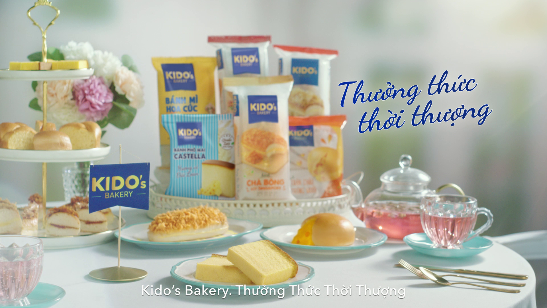
Still embracing the essence of "SAVORY IN STYLE", but now enhanced with "PERFECT FLAVOR" to highlight the fresh and delicious taste of Kido’s cakes.
My Role:
. GDN & Material graphic design
. Key Visual design & production
. Doing & learning production process
. Doing & learning post-production process
Credit:
. Creative Director: Nguyễn Thanh Nga
. Associate Creative Director: Nguyễn Hoàng Minh Thi
. Art Director: Nguyễn Ngọc Bảo Hân
. Sr. Graphic Designer: Lý Tuấn Khiêm
. Copywriter: Uyên Lê
Information:
. Agency: VBA-ADK
. Client: Kido's
. Account Manager: Ly Hoàng
. Production House: May Production
. Director: Khuong Vu
. Photographer: Viết Quý
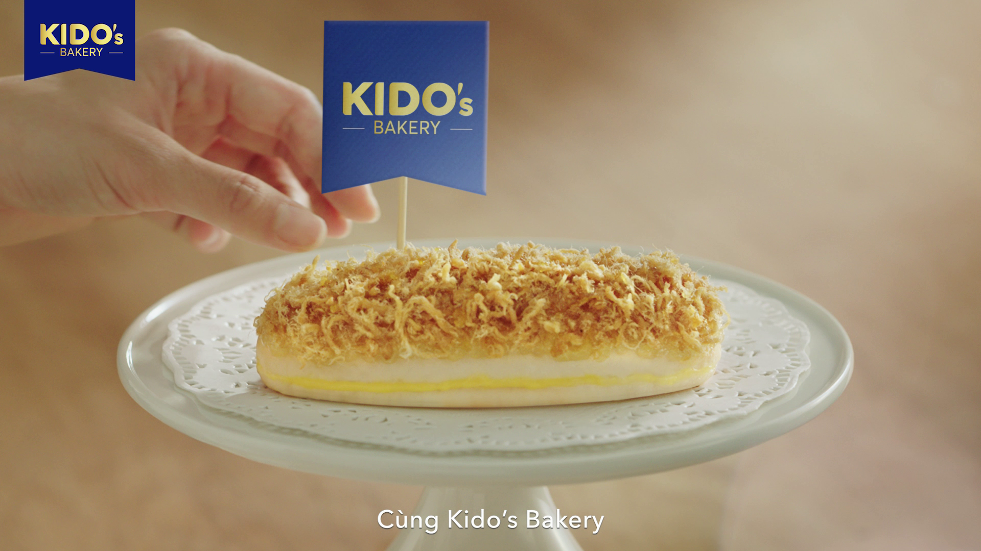
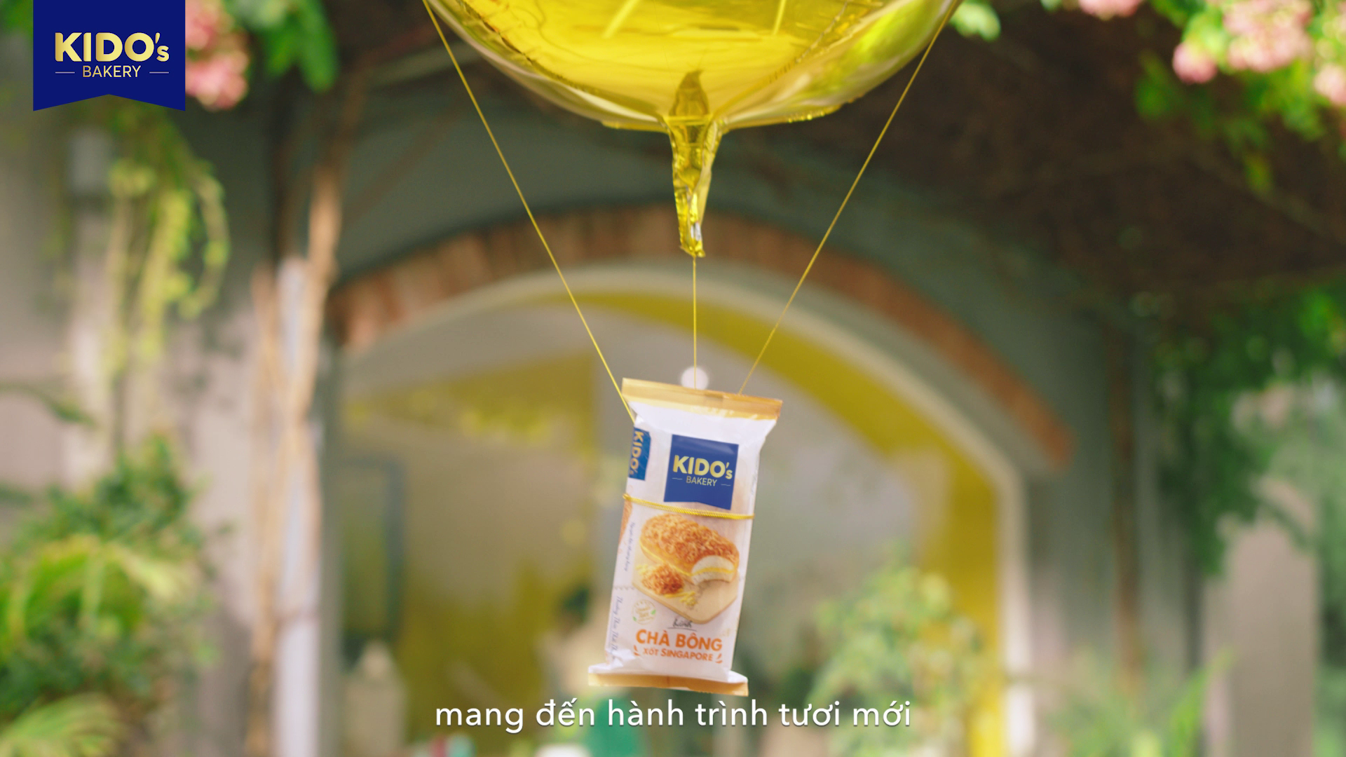
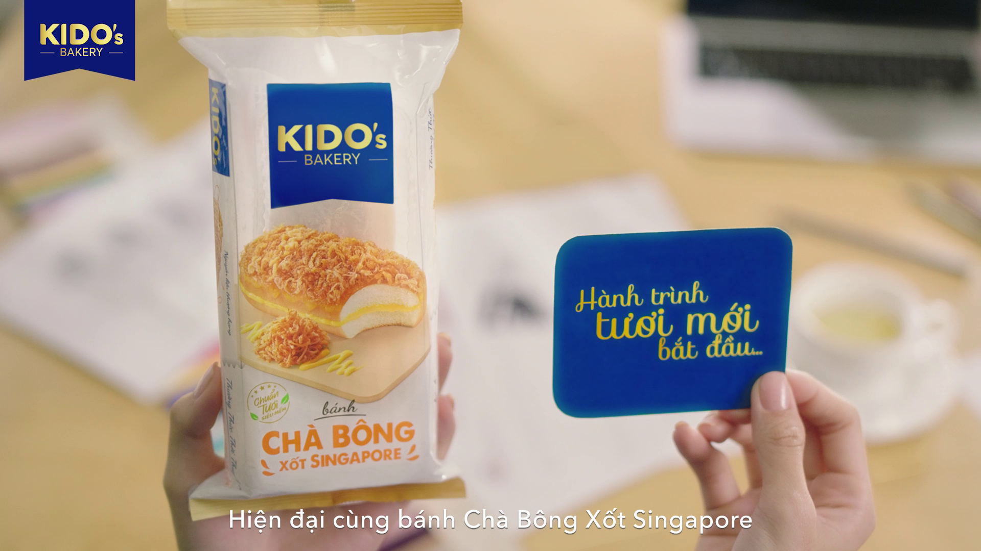
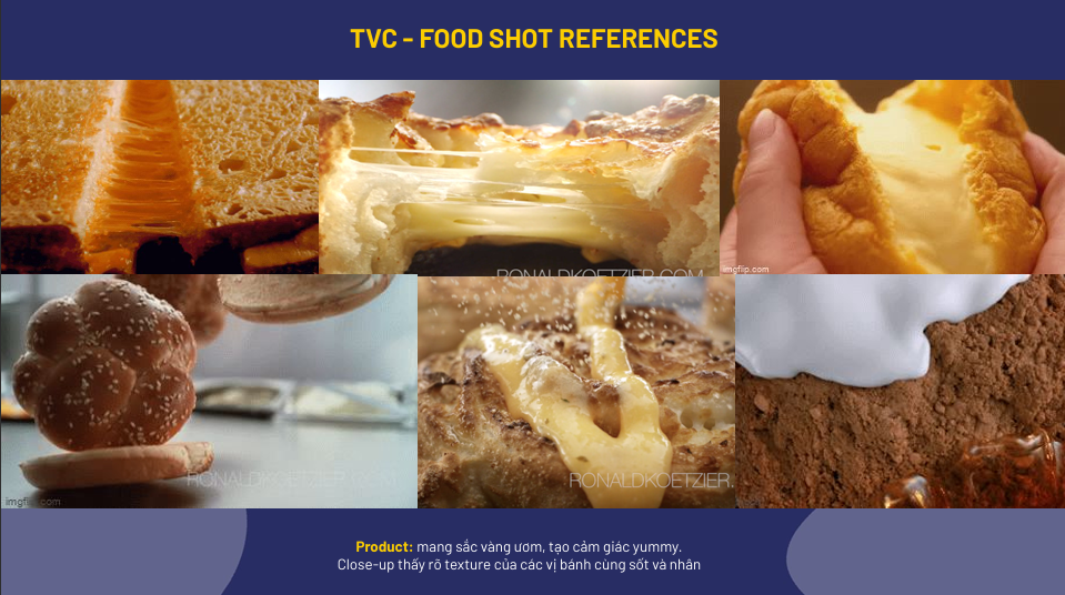
Product Film 15s
Adding "PERFECT MATCH" to "IN STYLE" emphasizes personal flair when enjoying any Kido’s fresh cake, while also suggesting that Kido’s flavors always align with customers’ preferences.


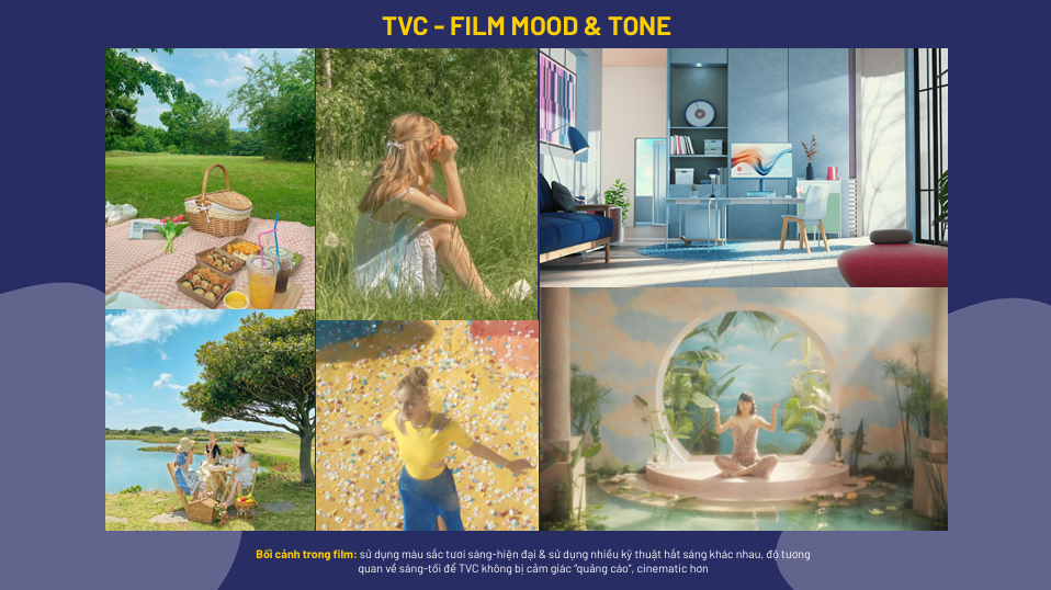
Mood & Tone
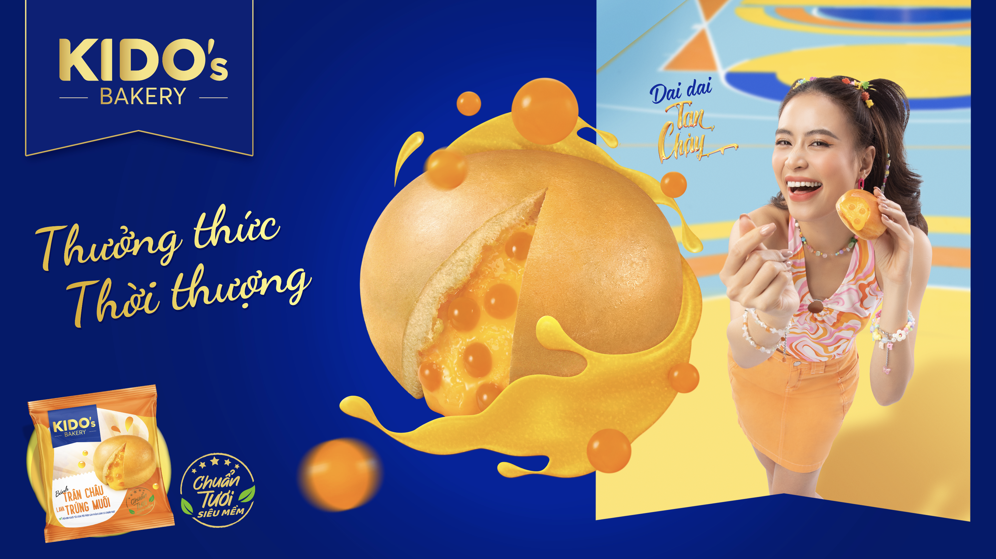
KEY VISUAL
Use KIDO'S signature blue as the primary color, combined with graphic patterns
representing different cake lines to create a more vibrant & modern identity.
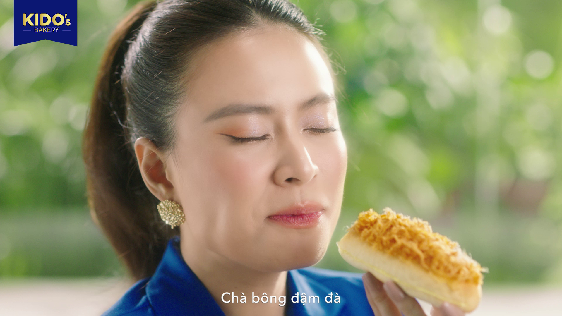
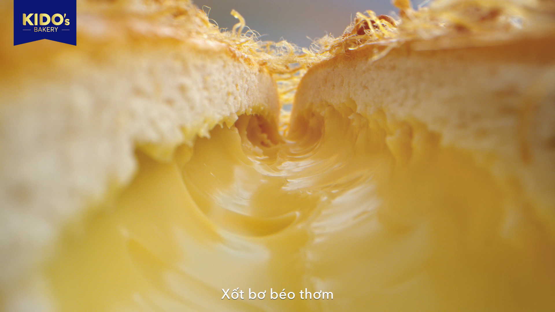
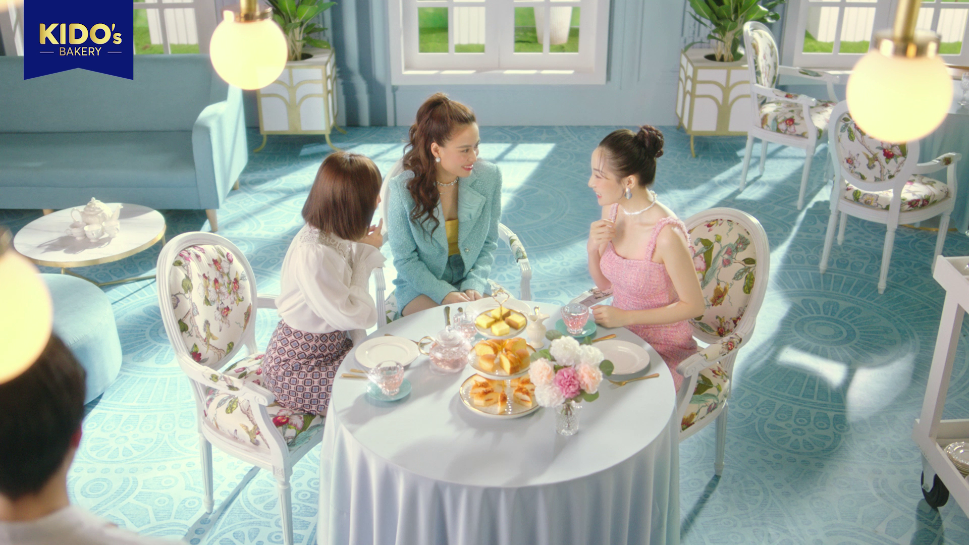
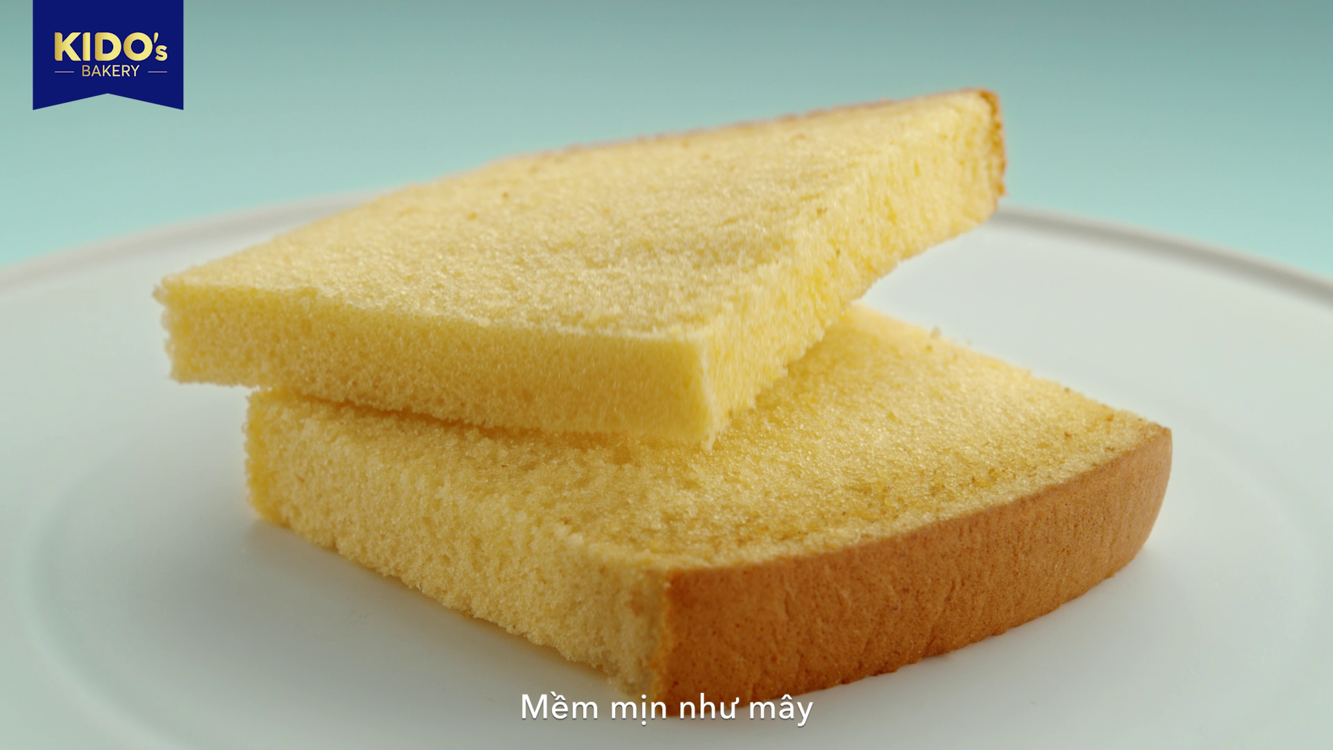
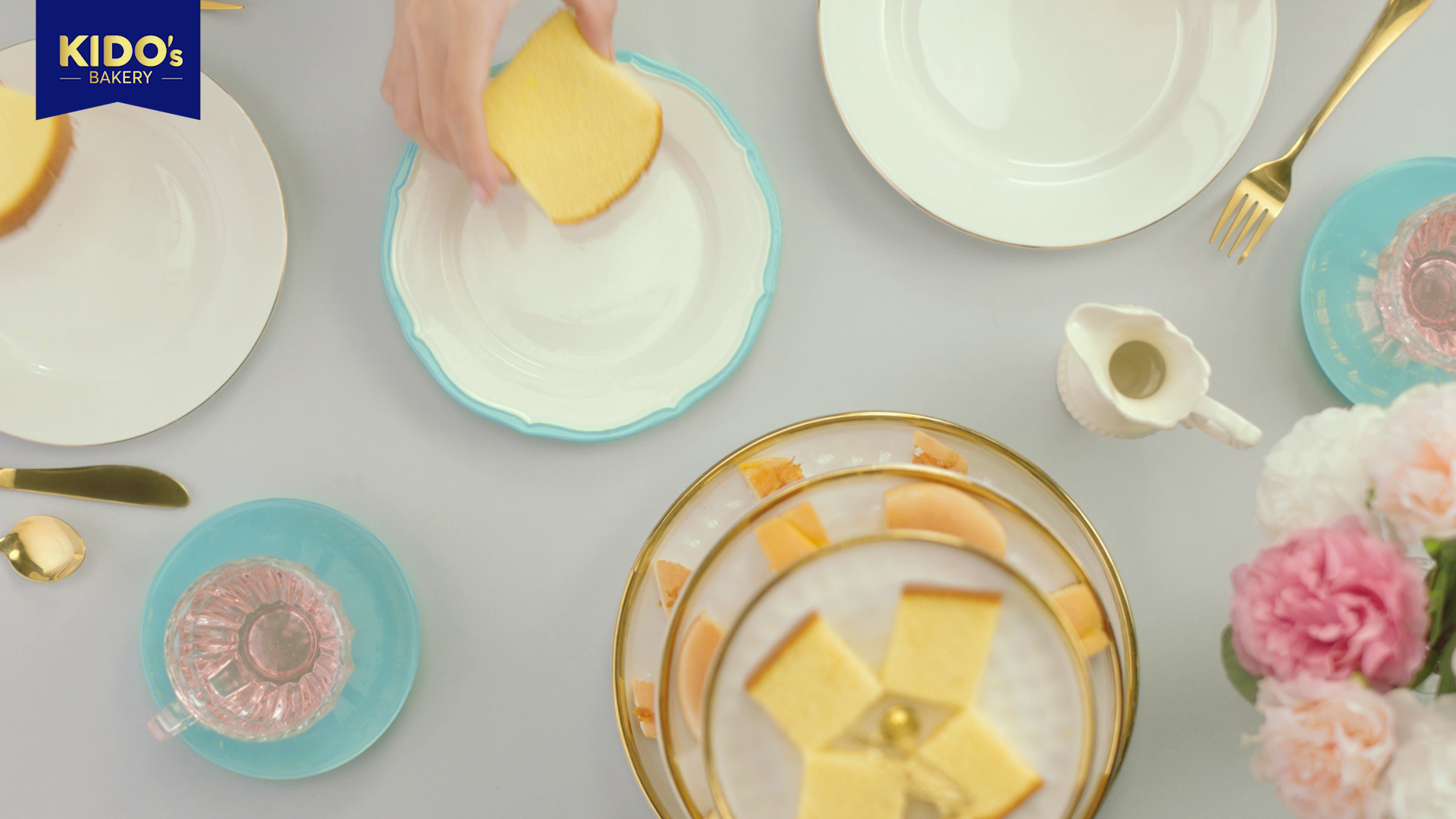
Focus on highlighting the packaging & fresh ingredients inside the cakes to emphasize their deliciousness & quality.
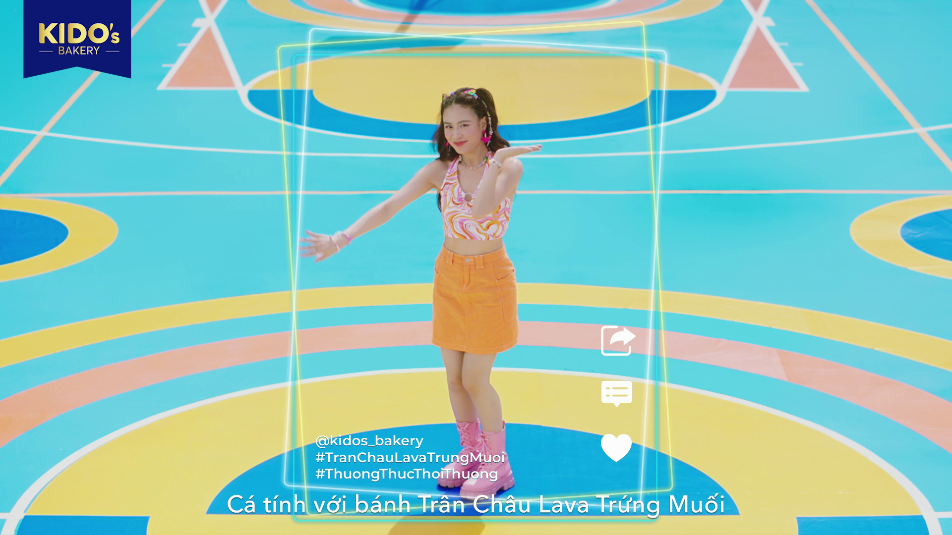
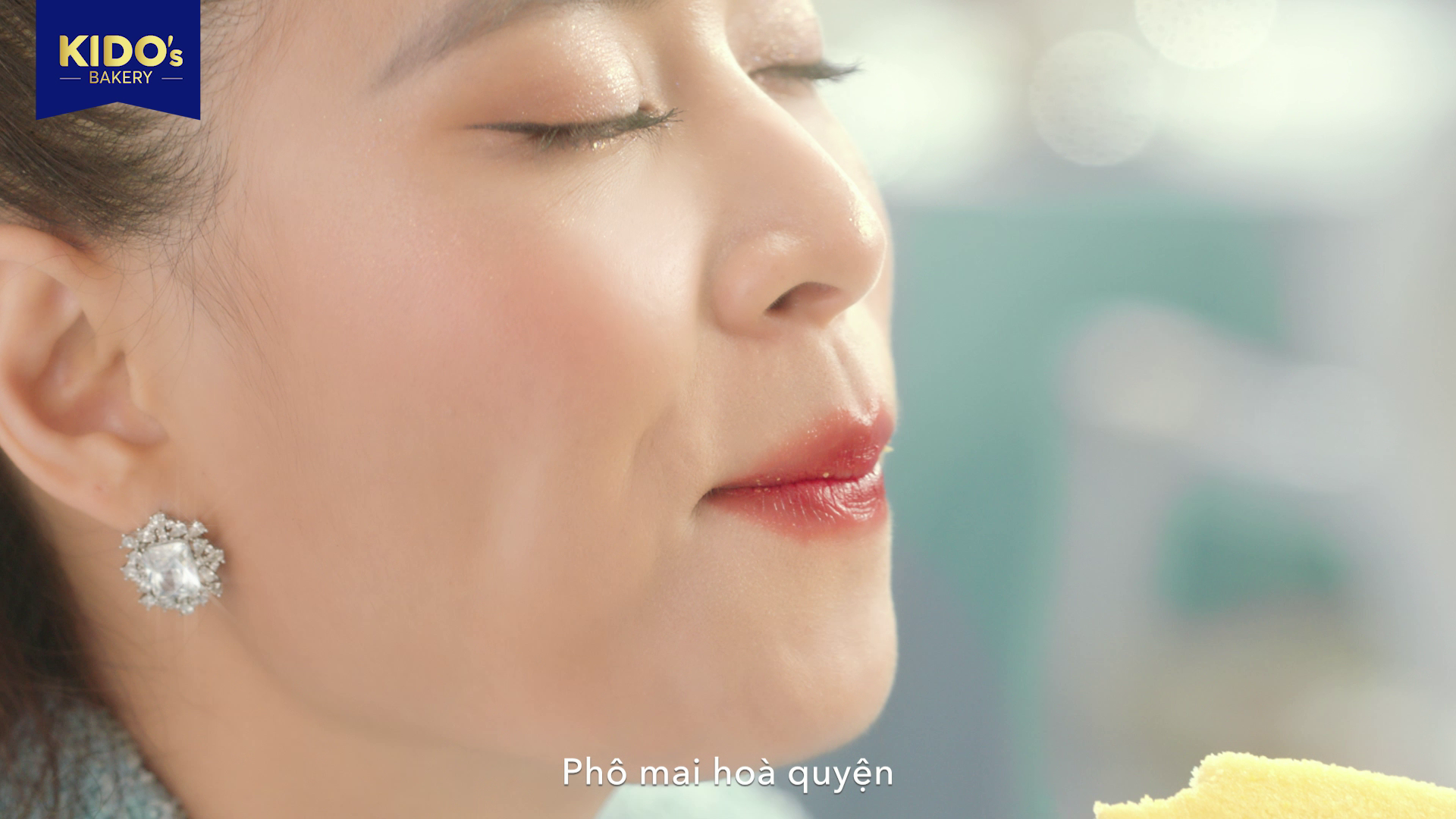
The consumption shot should align with the cake's flavor colors and character style, ensuring stronger and clearer branding.
Drafting KV
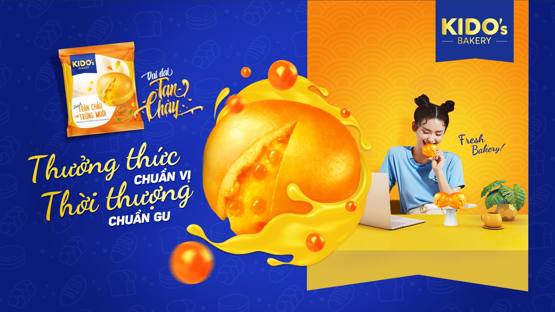

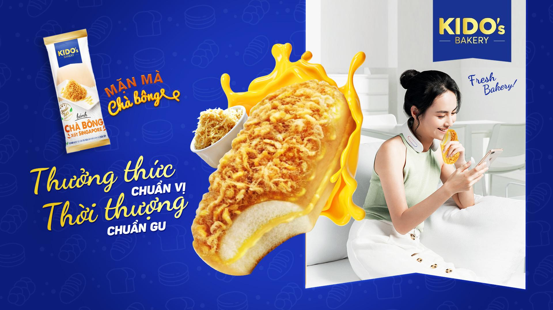
Final Key Visual

